Selected Work / Case Study
Coursebox.ai
Client Sector
AI-powered Learning Management System (LMS) / EdTech SaaS, subscription-based
APPROACH
Persona-led dashboard redesign, benchmarked, prototyped, and usability-tested
Timeline
6 Weeks — Design sprint, concluded at engineering handoff
Business Metric
54% drop-off addressed; reporting usage up 70% in testing
Role
Product designer leading reporting-suite redesign and dashboard strategy across creator, admin, and learner personas

01 / THE STAKES
Make reports make sense
Coursebox.ai is a subscription business, which makes engagement an existential metric: customers who stop finding value stop paying. Dashboard access was dropping 54% by week two of each month with heavy abandonment by week three, meaning the reporting suite, the product's main retention surface, was generating churn instead of preventing it. Doing nothing meant renewals eroding month on month. Success was defined before design began: users returning to the dashboard beyond week two, reports generated without manual labour, and a measurable reduction in abandonment.

02 / The Structural Conflict
How come everyone is just breezing past the dashboard?
The platform had no personalisation layer. Dashboards displayed the same generic dataset regardless of user role, and generated reports ignored every filter the user applied, returning the full student dataset each time. This forced creators and learners to act as data analysts, produced a "manual labour trap" for admins lacking real-time enrolment tracking, and surfaced unnecessary elements (like "My Drafts") in the student interface. The result was a 54% drop in dashboard access by week two and high abandonment by week three.
“The dashboard feels cluttered. ‘My Drafts’ is in the student interface, despite being relevant only for admins.” — Learner interview
Design response — split one generic view into role-based dashboards super-admin, creator, learner each showing only what that role needs.
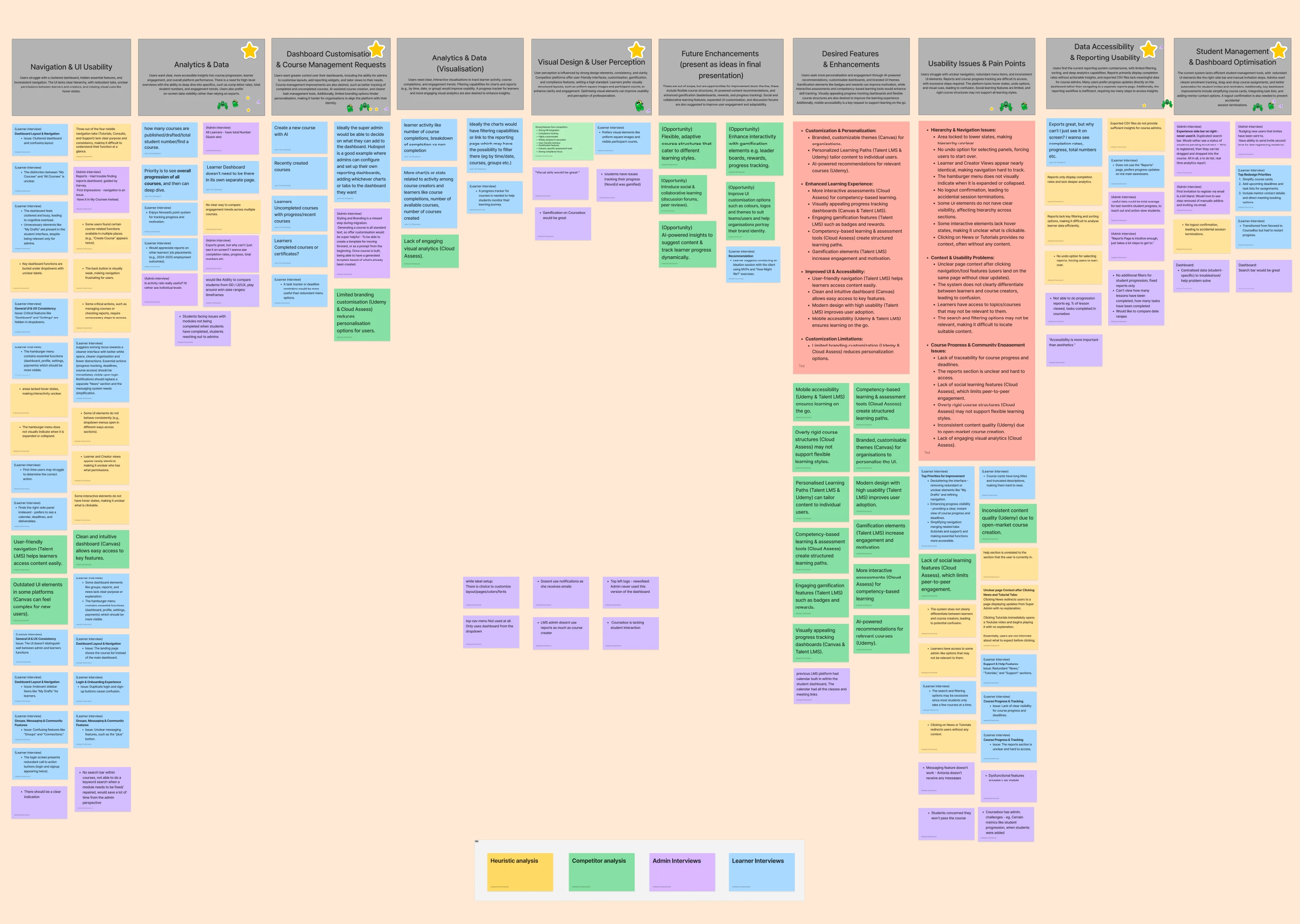
A competitive analysis benchmarked how industry leaders presented at-a-glance data, revealing the dashboard was increasing cognitive load rather than reducing it. Two primary user groups (creators and learners) were interviewed across two axes: abandonment (why users walked away) and workarounds (how persistent users manually overcame data gaps). Quantitative access data from the Coursebox team paired with qualitative interviews. Findings were triaged against sprint constraints and engineering feasibility, prioritising the broken reporting system and empty dashboard as the main abandonment drivers rather than fixing every UI element.
03 / Heuristic Tactics
Designing against the clock
A competitive analysis benchmarked how industry leaders presented at-a-glance data, revealing the dashboard was increasing cognitive load rather than reducing it. Two primary user groups (creators and learners) were interviewed across two axes: abandonment (why users walked away) and workarounds (how persistent users manually overcame data gaps). Quantitative access data from the Coursebox team paired with qualitative interviews. Findings were triaged against sprint constraints and engineering feasibility, prioritising the broken reporting system and empty dashboard as the main abandonment drivers rather than fixing every UI element.
“Exports great, but why can’t I just see it on screen? I want completion rates, progress, total numbers.” — Admin interview
Design response — replaced CSV-only exports with an on-screen reporting canvas: headline metric cards, visual charts, PDF export.
04 / DECISIONS & TRADE-OFFS
Triaging the problems
A six-week sprint forces triage. With no embedded engineers, feasibility was assessed through gut-check sessions with the engineering lead, weighing API constraints and what data could be pulled live versus cached. Every candidate fix was scored on effort against abandonment impact, and the deliberate call was to fix the broken reporting system and the empty dashboard, the two main abandonment drivers, and leave cosmetic UI issues untouched. The assumption underneath was explicit: users were leaving because the product gave them nothing to return for, not because it looked dated.


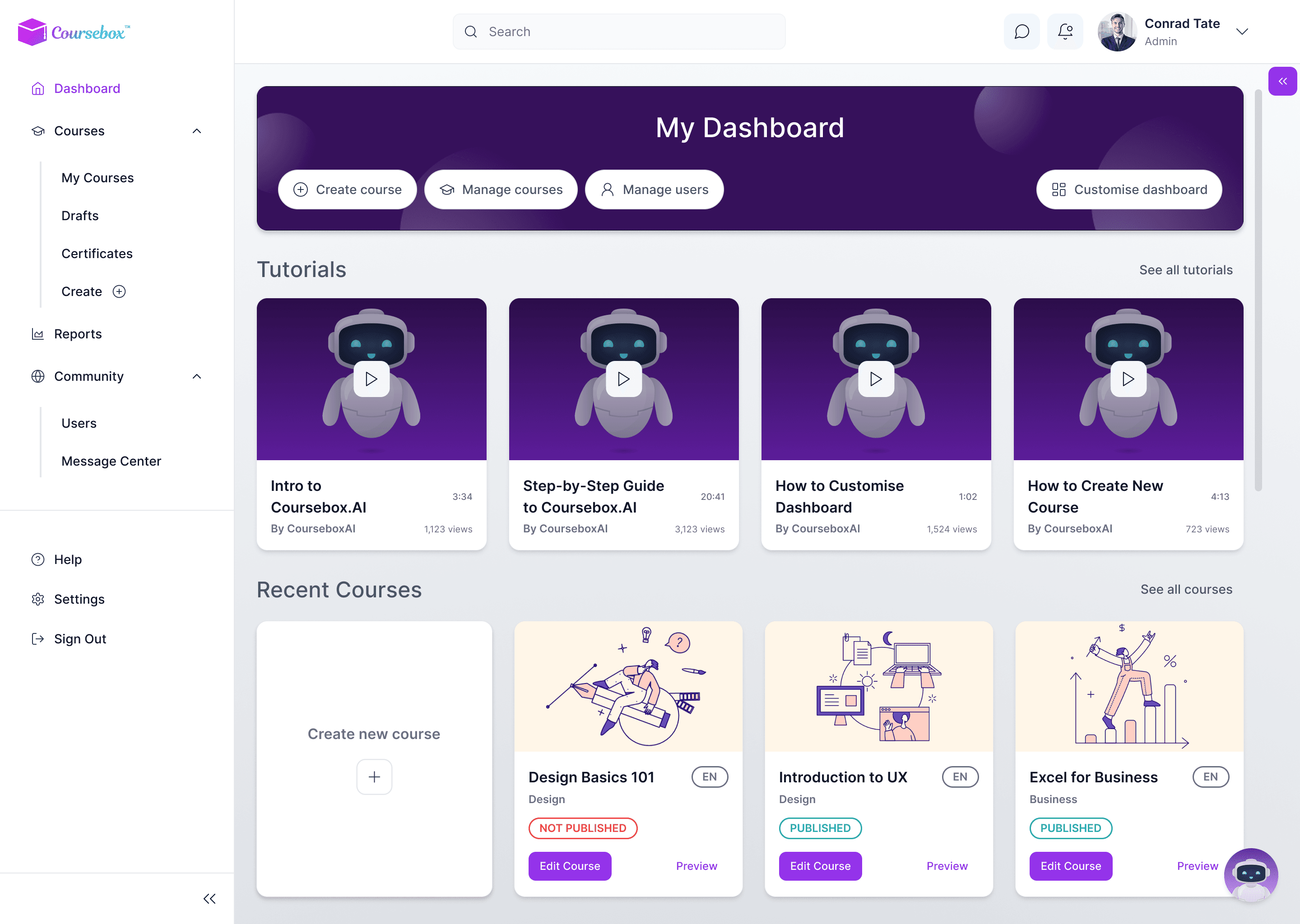

Learners told us the shared dashboard was cluttered with admin-only tools like “My Drafts.” The team’s research pointed to role-specific views; my design response split one generic dashboard into three super-admin, creator, and learner each surfacing only what that role acts on.
Research surfaced a recurring admin need: flagging students who’d gone inactive, and acting on it without digging. My design response an at-risk detection card that surfaces disengaged learners and lets an admin send an alert in a single click.
05 / The Architectural Resolution
Restoring the promises made
The reporting page was rebuilt around progressive disclosure with customisable widget modules, letting users filter by course and cohort and preview filtered data live before export, cutting a data-dense CSV chore down to three clicks. Role-based dashboards replaced the persona-blind landing page: creators received an at-a-glance "Course Health Check" surfacing at-risk students, enrolment, and self-selected metrics, while learners saw course health, assessment dates, and personal milestones. A design system with the brand team used colour as signal, reserving high-saturation Red/Amber strictly for "Action Required" items, and reduced learner sidebar options by 25%.
“The Reports page is intuitive enough — it just takes a lot of steps to get to.” — Admin interview
Design response — a progressive-disclosure reporting flow that gets a filtered, comparable report in three clicks.

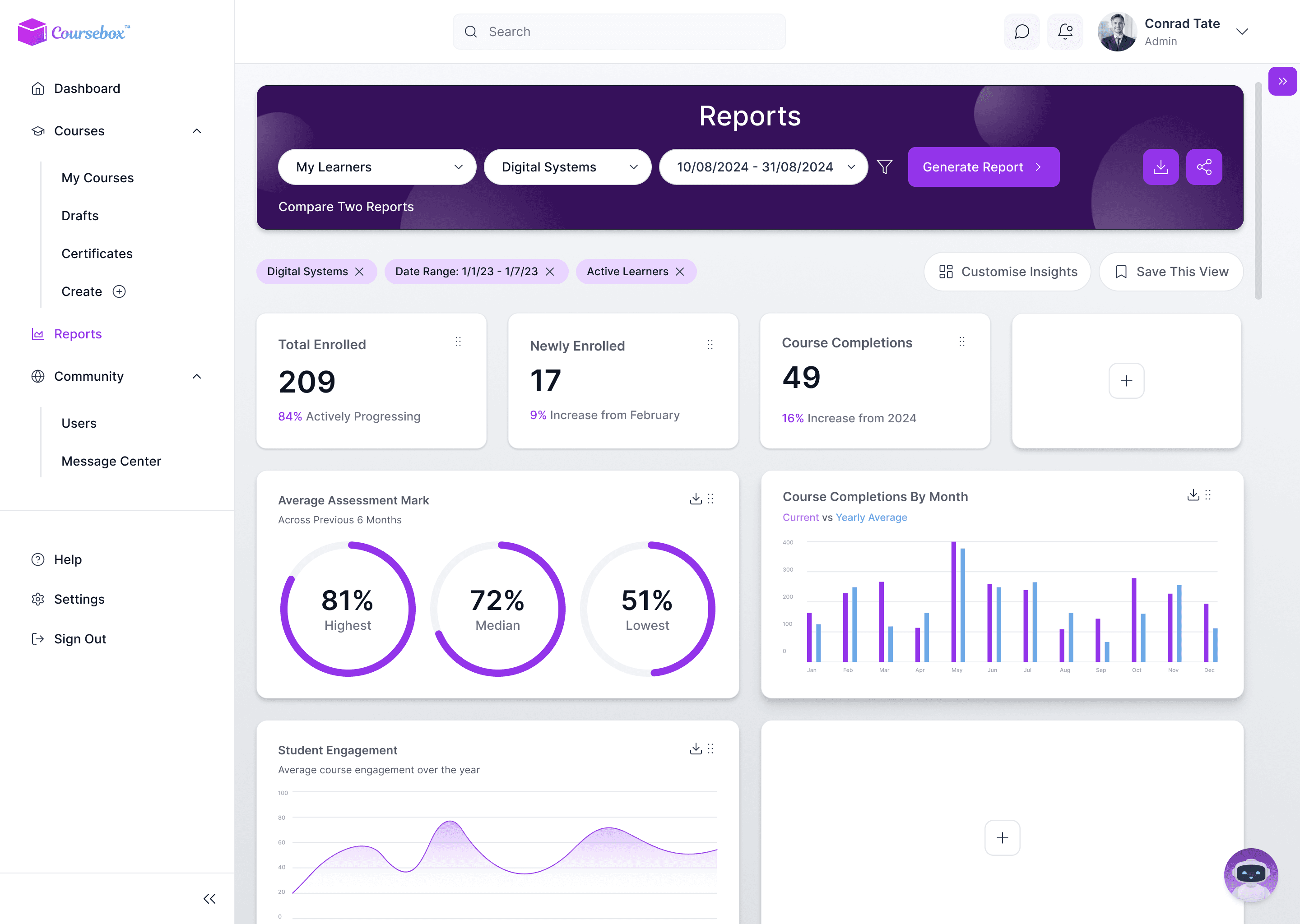


One admin asked, “why can’t I just see it on screen?” reports lived in CSV exports, several clicks deep. My design response replaced that with a progressive-disclosure flow: an empty canvas fills as filters are applied, ending in side-by-side comparison a filtered report in three clicks.
Research asked for dashboards users could shape themselves show, hide, rearrange. My design response — a widget library and customise overlay, so each role can build the at-a-glance view that fits how they actually work.
06 / PROJECTED IMPACT
What does success look like?
The sprint concluded at engineering handoff, so post-launch numbers belong to the client. The measurement plan was defined regardless: week-two dashboard return rate against the 54% drop baseline, reports generated per active creator, and support complaint volume. The leading indicators from testing pointed the right way: reporting-page usage rose 70% across usability phases, manual CSV filtering fell from a thirty-minute chore to three clicks, and users described the redesigned dashboard as exactly what they needed.
07 / Key Learnings
What the sprint taught me
Research is a risk management tool. An unused feature is an expensive feature: with a 54% abandonment rate, the project needed business risk mitigated, not a new coat of paint.
Technical alignment shapes what ships. Working with engineering on API constraints and feasibility meant handing over features that drive engagement rather than features that could not be built.
Validation is a success metric. Users describing the redesigned dashboard as exactly what they needed was qualitative proof the information architecture pivot was correct.